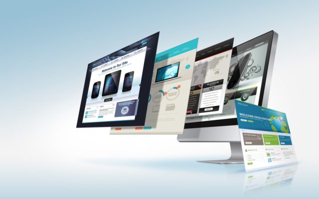
Today almost every new business wants a mobile version of their website. But are you going to have one design for the iPhone, another for Android or Windows mobiles and also for the iPad and Kindle? With Digital Transformation at its peak, the number of devices, platforms, and browsers that need to work with your site are growing.
Responsive Web Design (RWD) is an approach whereby a designer creates a Web page that “responds to” or resizes itself depending on the type of device being used. That could be a 17-inch desktop monitor, a 15-inch laptop, a 10 or 7-inch tablet, or a 4-inch smartphone screen.
RWD represents a fundamental shift in how we will build websites for the foreseeable future.
As the user switches from their laptop to iPad, the website will automatically switch to accommodate the screen resolution, content orientations as landscape, portrait or square and automatic image adjustments. You don’t have to double tap, pinch or zoom when a device is changed.
Simply put, your web page should look good and be easy to use regardless of the device it’s viewed on.
RWD uses cascading style sheets (CSS) and HTML to resize, hide, shrink, enlarge, or move the content, to make it look good on any screen.
In recent years, the internet has experienced a drastic rise in mobile website traffic. Browser-equipped phones will outnumber traditional computers at some point. Touchscreens are becoming increasingly popular. Right now touchscreens are mainly on smaller devices, but many laptops and desktops on the market also have touchscreen capability.
Consider some best practices in RWD:
- Check your traffic via Google analytics to find out where your users are coming from.
- Start with the mobile first approach and build a site with the smallest screen.
- Focus on the most important content to stay on the minimum size screen.
- Design considering mouse scrolling for desktops as well as touchscreen swiping for mobiles.
- Consider fingers of all shapes & sizes for touch.
- It should be compatible with iOS, Android, Windows or BlackBerry.
- Optimize the site for peak performance to load quickly regardless of device.
- Finally, test your design on actual devices.
Here are few great examples of RWD:
- Boston Globe covering news about Sports, business & Tech, Politics etc. Simply go to the site and re-size your browser window: the website will automatically adjust to the current width of your browser.
- Target’s corporate website content changing news and images as per the device
- The NASA website accommodates any screen size
You can see many more examples here:
Finally, all this new flexibility of layout can only help to optimize the customer experience.
Article by channel:
Everything you need to know about Digital Transformation
The best articles, news and events direct to your inbox


